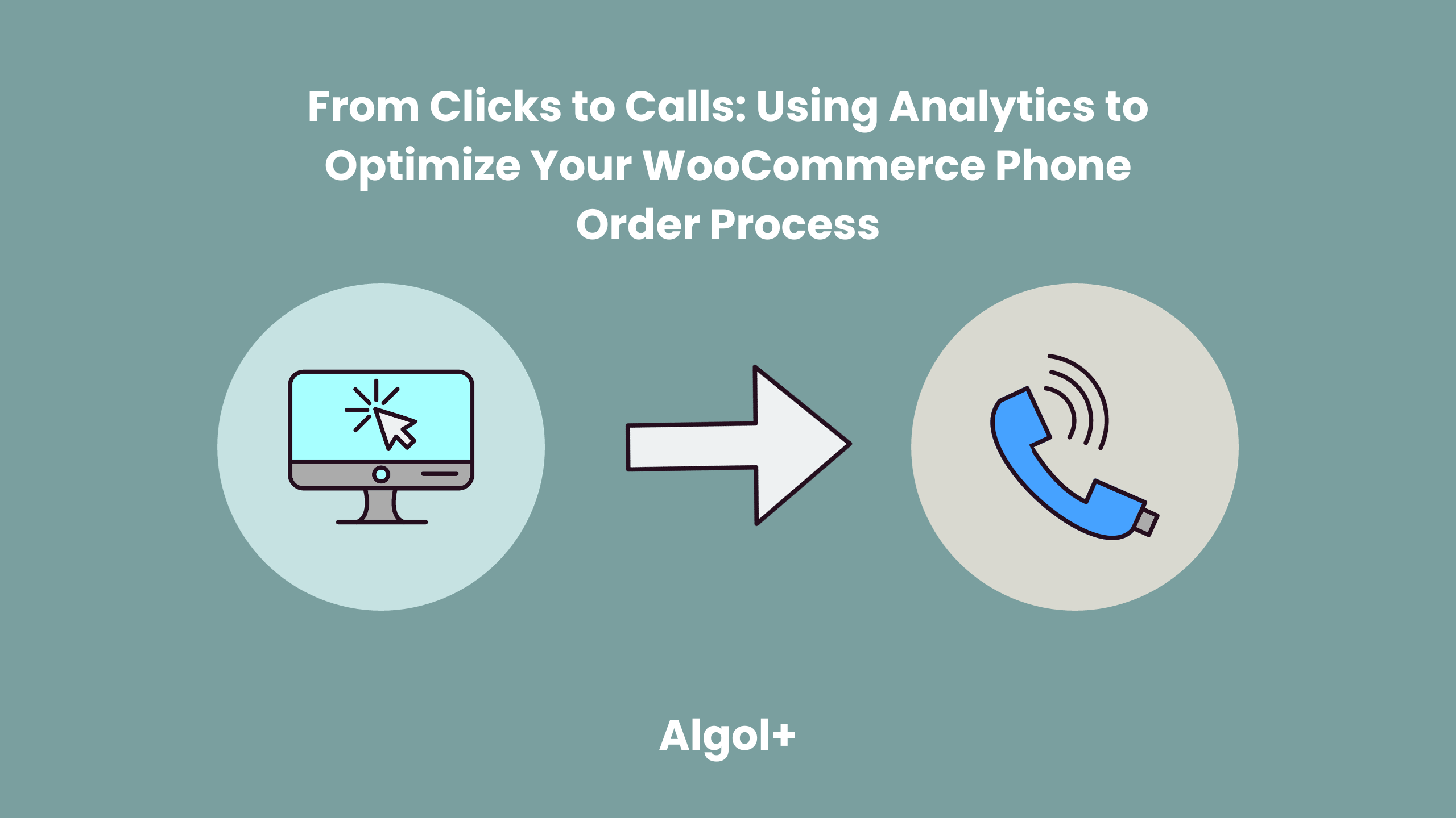
From Clicks to Calls: Using Analytics to Optimize Your WooCommerce Phone Order Process
Table of Contents
The success of any online business depends heavily on their ability to capture and convert customers. However, if your WooCommerce store is not optimized for phone orders, you could be missing out on a valuable source of revenue. In this article, we’ll discuss how you can use analytics to optimize your WooCommerce phone order process and turn clicks into calls.
What should you pay attention to in analytics?
Analytics provide valuable insights into customer behavior and website performance, allowing you to identify areas of your website that need improvement in order to boost conversions. Here are a few key analytics metrics to pay attention to when optimizing your site for phone orders:
- Bounce Rate
This metric tells you the percentage of visitors that leave your website after viewing only one page. A high bounce rate can indicate that visitors are not finding what they need on your website or that your website is difficult to navigate.
- Conversion Rate
This metric shows the percentage of visitors that complete a desired action, such as making a purchase or signing up for a newsletter.
- Traffic Sources
This metric tells you where your website’s visitors are coming from. Paying attention to this metric can help you identify which traffic sources are the most effective and where you should focus your marketing efforts.
- Customer journey
Analyzing the journey of your customers from their entry on your website to the purchase can help you understand where they’re dropping off and identify any areas of improvement.
- Device usage
Monitor the type of devices your customers use to access your website. This can help you optimize your website for different device types and ensure that your pages are optimized for mobile users.
How can you apply the obtained analytics?
Now that you know which of your settings are below or above the recommended level, you want to figure out how to fix them.
If you have a high bounce rate, then make your site clear.
The reason for the lack of calls is often found in the design. If a web page is poorly laid out, then it is unlikely to inspire confidence. It’s even worse when the site does not contain the necessary information: prices, contacts, tariffs and the products themselves. Or all the pages are filled with “water”, and the texts contain grammatical and punctuation errors.
In order to fix this, you need to invite a specialist or edit the site yourself. What to pay attention to and check:
- Legible font;
- Site navigation;
- The telephone numbers are operating normally;
- The site looks well-maintained, as does its mobile version, the images are of good quality;
- Contact information;
- The product offer is competently and clearly designed;
- All links work correctly;
- The site doesn’t take too long to load;
- The content corresponds to the expectations from the advertisement seen.
Thanks to these actions, you can achieve a low bounce rate, but also ensure that the customers reaches the end of the purchasing journey.
If you have a low conversion rate, then set up contextual advertising correctly.
Of course, if you have any. And if so, perhaps you have a situation where you have clicks but no conversions. Why does this happen?
There are two key points: whether the ad itself is well set up and the page to which it leads.
The task of contextual advertising is to “reach out” to representatives of your target audience (potential clients) and show them your advertisement. If your ad attractes them, they will click on it and go to your landing page. Next, they will see your page, which should continue the advertisement that the person clicked on, present the company and its main offer, involve in studying the page, close all key objections, build trust, show the assortment, lead to the main or intermediate conversion.
Does everything seem easy and impossible to make a mistake? But nevertheless, if you relax at the moment of setting up the ad, you will get a completely uninterested audience.
What should you do to avoid this?
First of all, remove non-target key phrases. For example, if you provide any non-free services, then you do not need to include “we will provide the service for free” in your phrases. Another example when a phrase can be understood in a different sense. You may have your own business in the quiz, and if you add “quiz for lady” to your key phrases, then you will face the fact that you will not get conversions, since your phrase is essentially the name of the movie (quiz lady). Users searching for this phrase obviously want to watch a film.
There is also another problem with key phrases – their incorrect grouping. Let’s look at the example of an online store of women’s dresses. Unprocessed queries and all phrases, in particular regarding types of dresses, lead to one page – the main page. When typing “stripe dresses”, the user expects to see only striped dresses. In this case, it was worth dividing the phrases into groups (polka dot dresses, mini dresses, etc.) and defining the corresponding page for each group.
Finally, the last but not least thing you can do is to target the right target audience who will see the ad. Most often, the analytical system attached to your website (age, region, behavior on the site) containes all information on your target audience.
If you have low conversions from mobile devices, then adapt your site.
More than half of Internet users from all over the world view web pages from a mobile phone, so it is important to adapt your landing pages, websites and other resources for the mobile user. This will help you avoid losing this audience due to the fact that it is inconvenient for them to read text or fill out a form.
How to adapt a website for mobile users to provide them with ease of use, registration, leaving an application and not lose in conversion:
- Simplification of design and content
Get rid of design elements, without which the landing page will not lose its meaning and remain intuitive. Remove all images that take a long time to load, hide some elements under buttons (for example, “Show more”), discard the video embedded in the page (for example, on the first screen).
Make sure that the images you leave on the site match the width of the mobile screen.
In addition, try to compress images using special services – this will reduce their size without significant loss in quality.
- Vertical scrolling and finger taps only
In order for the user to conveniently use the mobile version of the site, he must be able to do this with 2 simple movements – scrolling up and down and pressing a button.
If the user has to enlarge the text, scroll the page horizontally, or reach with his finger to press a button, he is likely to leave the landing page due to inconvenience of use.
- One touch call
Instead of a contact button in the corner, it’s better to make it possible for the user to call a phone number on the landing page with one click. At the same time, it is desirable that the phone number also places conveniently, avoiding the extreme corners where it is difficult to reach.
- Button on the first screen
According to statistics, 53% of sites where it takes more than 3 seconds to search for a button lose potential customers. This is too long. The CTA should be detected within 1-2 seconds. Ideally, the button for performing the target action should be located immediately on the first screen, without the need to scroll, easy to press with your thumb. It should be a contrasting color so that it is immediately noticeable.
- Short application form
Do not overload the application form, especially in the mobile version. Filling it out is already difficult, and if there are many fields in it, the user will most likely not do it. Limit yourself to 1-2 really important fields.
What else can be optimized?
Optimize your phone order! The simplest way to do this is to use the phone order system. This systems make it easier to manage orders, track customer information, and process payments.
Phone Orders for WooCommerce is a great way to add more convenience to your customers. This plugin allows you to easily manage orders placed via phone. This gives you to quickly process orders from customers who may not have access to a computer, or who would prefer to call to place the order.
Among its main advantages:
- Intuitive interface.
- Possibility of use as a POS system
- Barcode scanner available
- Storing customer information
- Support composite/bundled/other complex products
- and more.
Phone Orders for WooCommerce is easy to set up and use. It takes just a few minutes to get started:
- Make sure your store runs on WooCommerce.
- Download and activate the plugin.
- Read about the order acceptance process.
- View our other articles about all the features of this plugin to customize it to the needs of your business.
If you’re a WooCommerce store owner, Phone Orders for WooCommerce is definitely something you should consider.
Finally, we recommend continuing to review your site analytics and monitor current trends in your area. Times change, and so do customer preferences. Your supply must match demand. Work on this and the result will not keep you waiting.